
If web online forms are designed well, they help people to register on the site more easily, subscribe to newsletters, make purchases... On the other hand, poorly implemented forms can be a real obstacle for potential customers. They can drive the customer to the point where he stops trying to fulfill it.
Graham Charlton has collected 21 examples of proven form forms from various websites.
The article was revised and updated in May 2026.
Clear explanation of form fields
Threadless has a great example form. Simple text in parentheses next to form fields elegantly avoids a lot of potential input problems.
Password security indicators
We all know the pointers to password security, but some people ignore these recommendations.
Greeklist takes a different approach to help the user take more pains to create a good password.
Data accuracy check form
How to protect the user from incorrect data that could be sent through the form? This form of the form also prevents the next step before the user finds and corrects the error.
Autoglass either approves or corrects what the user has filled out.
Correcting an incorrect email address
Kickstarter's forms will suggest an obvious email address if there is an input error. This step can prevent potential problems.
Simple entry for mobile phone users
Optimizing forms for mobile phones is about reducing the number of required data entries.
The Kayak mobile site detects the customer's location and thus reduces the time a person would have to spend typing it out. The settings are also designed for larger fingers.
Customization of the form for the target audience
Wiltshire Farm Foods delivers meals and their customers are predominantly elderly people.
They tried to make the payment page and verification forms easy to use.
capitalization
When people on Flickr accidentally leave caps lock on, their message is overwritten in lowercase.
Card payment via mobile phone
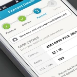
Murat Mutlu on Dribble has a great payment card scanning option that can save the user a lot of time.
Card type recognition
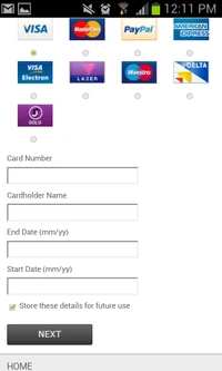
This useful feature, on Github, recognizes the type of payment card as soon as the user starts typing the credit card number.
Anything that shortens the process of filling out the questionnaire is welcome.
Design can convince
A nice form design can help convince the user to fill it out.
Easy repeat purchase via mobile phone
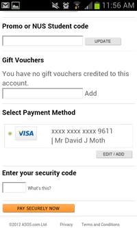
Asos stores payment card data (if the customer agrees). This makes repeat purchases easier.
Once the customer has entered their login details, the next time they make a purchase, they will only need the card's security code to complete the transaction.
Nice design
The Barley site has a form where the user can rate the beer. It has an impressive design and works very well.
Vertical alignment of the form on mobile
For mobile phones, the vertical alignment mark works very well. It means that form fields and buttons don't have to be crowded together.
Solutions to frequently asked questions
Sometimes users want to know why specific data is requested from them. If you provide them with this information in advance, you will increase the chance that the user will fill out the form.
Moneysupermarket provides this information right next to the box.
Delivery option clearly marked with the product
The John Lewis iPhone app shows a delivery option for every product. It also offers the option to click through for more details.
Slider showing the urgency of contacting
This is a neat tool from Wopat that tries to estimate how urgently users need an answer.
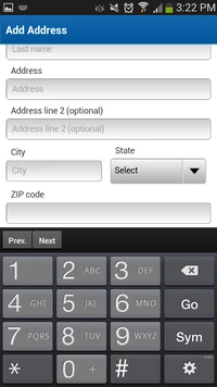
Input tailored
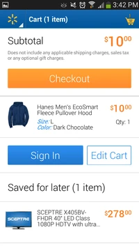
Walmart displays a numeric keypad for entering a phone number. numbers, thereby simplifying the customer's work.
Mixing of input data
The contact form mixes different input styles and makes the process much more fun.
Incoming verification page
Staples has a site that is a great example. The ability to try out the site as a guest is essential primarily because of customers who might be put off by mandatory registration.
At the same time, Staples underlines the benefits of registration and allows customers to easily create an account later.
Live chat in the basket
House of Fraser's shopping cart does not require any mandatory registration. At the stage when customers may have questions about the purchase, it uses a proactive chat.
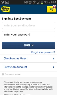
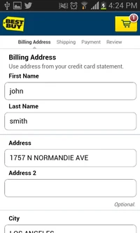
Checkout for mobile phones
Best Buy has an excellent checkout for cell phones.
Despite the fact that the customer still has many steps left to complete the action, large text fields and clear activity names create easy navigation for him.
Text boxes are very well designed for touch screens. It also omits any unnecessary information, so the pages are clear.
Source/Translation: https://econsultancy.com/blog/64669-21-first-class-examples-of-effective-web-form-design/